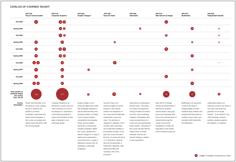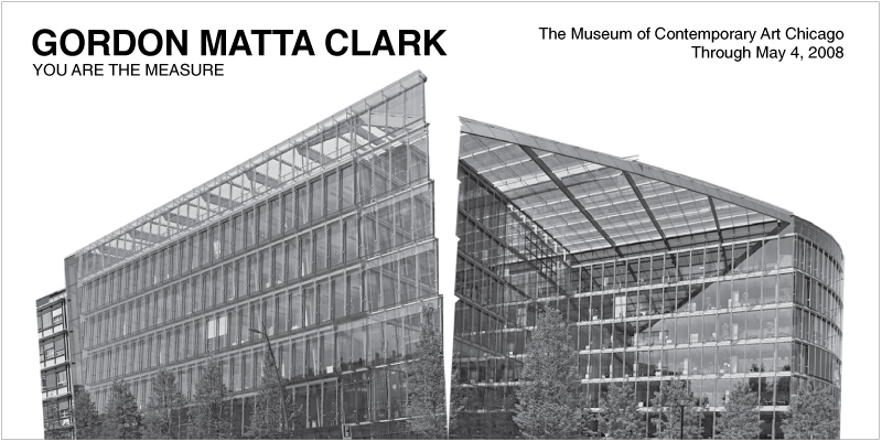
I do love to create infographics. The first two were produced for Saint Xavier Art Professor, Nathan Peck’s tenure dossier book. The first chart is a list of all the courses he has taught, along with course description, total number of students in each course and the frequency or corresponding semester for each course. The size of the red dot is relative to the amount of total students he has taught for the course.
The second diagram was also created for Nathan Peck’s tenure dossier book. This diagram illustrates visually the locations and names of all his professional gigs or exhibitions across the United States.
The third diagram was created for UrbanLab for their “Growing Water” book. This diagram illustrate the water cycle for Bay City, Michigan.
— Read more

These are posters created for “Graphic Design for Architect” course. The longer poster is tabloid and the small one is letter size.
— Read more

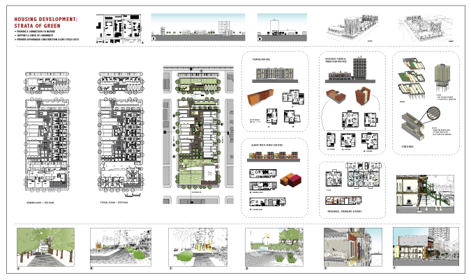
These are presentation posters I created back when I was in architecture school. The landscape posters are approximately 12′ x 7′ and the portrait one is approximately 3′ x 10′.
— Read more

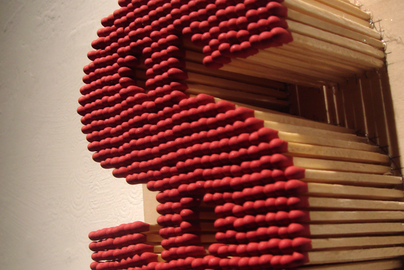
This match stick dollar sign art was made for the current Chicago Art Department $200 exhibition. This is a collaboration between Nathan and I. I first wanted to make art with balsa sticks, specifically a skeletal framed apple. This idea came from my architecture model making days. I love making models out of sticks. However, now that I am out of school and out of work, my resources are limited and balsa wood sticks can get expensive. As an alternative, Nathan suggested that I use match sticks. They can be found at Home Depot, 750 count for approximately $4. Thus I began making things out of matches. The first few were apple and letters, to be spelled out into words. Every time when I finish making one, we badly wanted to burn it immediately. This first finished 7″ x 9.25″, match sticks on poplar piece is called Temptation. I actually made two, one for the show and another for us to burn. We took photos of the burning as a visual tease for the unburn piece. For me, the value of $200 is a temptation. It is Nathan’s temptation of blowing it all away one night at the strip club.
— Read more

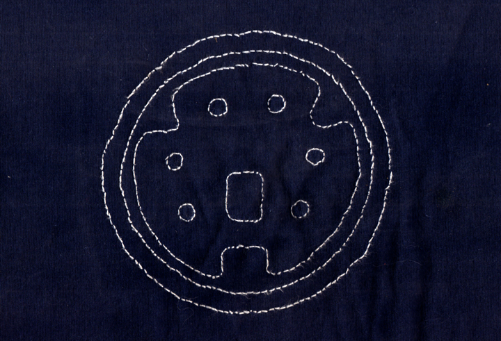
This PS/2 computer port is hand-stitched onto a T-shirt. The idea of combining computer ports and stitching came about by me wanting to use the medium of stitching, an analog traditional storytelling craft with contemporary digital theme subject matter of computer ports. I wanted to tell the story of passe ports.
First, an illustration of a catalog of computer ports were drawn. Then one image was blown up and printed onto vellum. The vellum is then overlaid onto the T-shirt, to be used as a guide for the stitching. This is the first and only that I did and the shirt was given to Nathan. As you can see from the photo, he loves the shirt for it is a well-worn shirt.
— Read more

This is a banner I made for the Chicago Art Department website. It was a membership drive post image. I decided to use a hand-drawing because this banner was made right after I was recruited by Nat Soti to be a visual note-taker at an art education conference. I was inspired by the event and fellow visual note-take, Kristine Borcz. From then on, I have decided to draw more. In this banner, I also decided to use my marker skill I learned from interior design school. A little side note on using markers to shade, the most important color is the blender marker – just the solvent and no pigments.
CAD is still looking for members to join. If interested, please visit CAD website.
— Read more

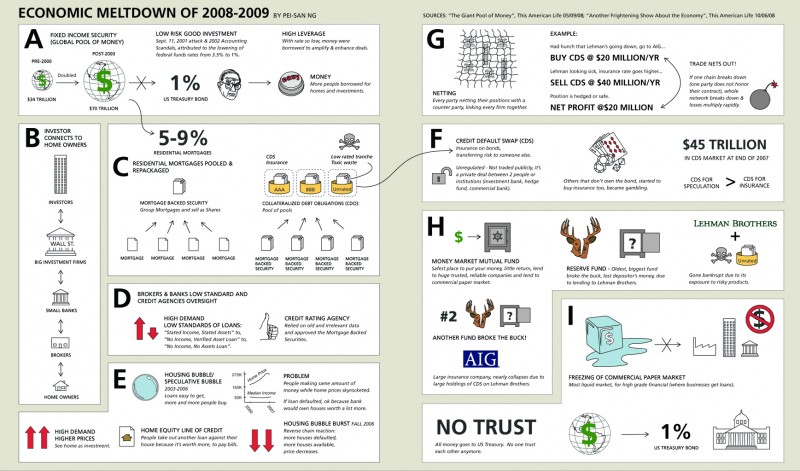
This info-graphic was made in February 2009 as entry in the Good Magazine competition. The competition called for a graphic description of the economic meltdown of 2008-2009. Looking back, I should have done some editing. I packed too much information onto a two letter sized spread. Though I did learned a lot about current economic issues and terminologies. There’s nothing better than a research based art where you learn something new while doing something that you love.
— Read more

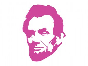
This Lincoln portrait illustration was also made back in Winter 2008, for the 200 Lincoln Show at Chicago Art Department (CAD). The illustration was then made into a T-shirt using iron-ons. On the back of the shirt, it has number 16, to represent the 16th president. Only one was made and this unique shirt was bought by Seth Gershberg. Thanks Seth for the love and support.
— Read more

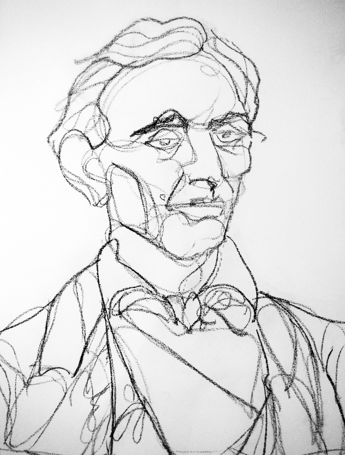
This 18″ x 24″ charcoal portrait was made back in Winter 2008 for the 200 Lincoln show at Chicago Art Department. The show occurred back in February 2009, just in time for us to celebrated his 200th birthday. This was the first time I drew since high school art class which was over fifteen years ago. Not bad, huh?
— Read more

These postcards were created back in Winter 2008 for the promotion of a new architectural gallery, named “demo.”. The gallery is about demolishing convention, demonstrating ideas and exhibiting democratically. The gallery is a venue/outlet for young architects and designers to display their creativity, passion and skills. The original founders were Lindsay Grote, Sarah Forbes and I. Sarah and I bowed out due to relocation and work load. It was slated to open last summer. I’ll have to get an update from Lindsay as to the status of this organization. Please keep posted…
— Read more
