A little love is a crush.
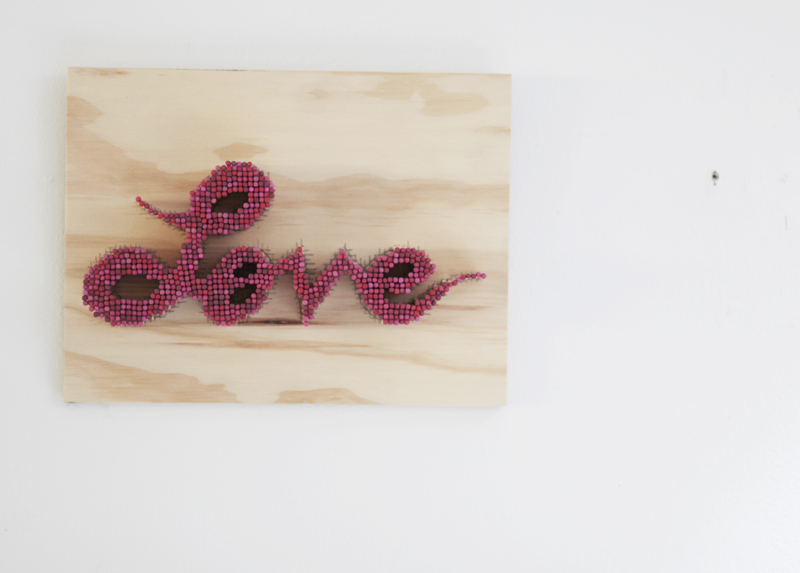
After my first big “love” piece was sold, I missed it. I decided to make another love piece for myself.
So I got these vintage matches from my friend Tanya. The matches are much shorter and their colors varied. The love piece is also much smaller, canvas size approximately 6″ x 11″. This photograph was taken by Marta Sasinowska.
— Read more

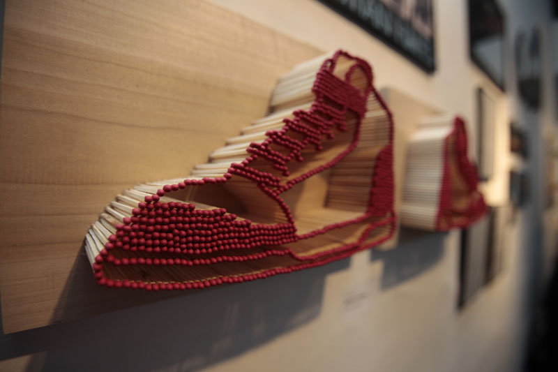
This pair of sneakers were made for my dear friend and roommate, Chris Hales, AKA DJ Tapedek, AKA Mookie. He passed away this early Spring.
In Chinese culture, we burn paper money so the spirit can take these notes with them to the afterlife. These papers are called joss paper. In contemporary culture, they have included paper cell phone, paper credit cards and paper boats.
I made a pair of sneakers for Chris to take with. He loves his sneakers and he always have the perfect pair to go with his fly outfit. He alway looked good. These sneakers were in his Tribute show entitled “Tapedek: The Afters Cool Show” at CAD on April 9th, 2010. One of the pair was burned at the end of the show with an intimate group of his friends.
Chris you will be missed.
— Read more

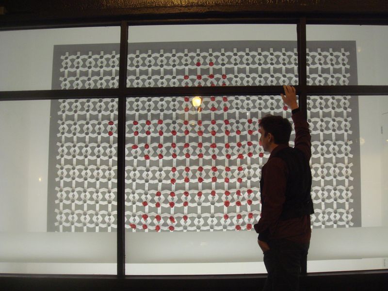
This is the first installation that I have done! I am very excited and have learned a lot regarding the process of making an installation. One important thing that I learned is that it’s always best doing it with a bunch of people. This piece took about 5, 12 – 18 hour days. I was invited by Jeremy Ehly, the curator of the “Show Pods” down at the Chicago Arts District in Pilsen, to make an installation using a ream of white paper. The show is call the “ReamScape”, still on display at 1839 S. Halsted (located right next to CAD).
The initial idea is to create 500 asterisks with a cylinder/ paper tube of varying length. Those units are laid out in a grid and some paper tube are filled with red paper, forming a bigger asterisk. These tubes with red tips were to mimic my matches burn series. On the computer, the red big asterisk is prominent because of the scale I was looking at it. Therefore, I named my installation: “asterisk: utilized performance enhancing drug”, making reference to the latest use of the asterisk symbol in baseball, to indicate a player’s use of steroid. The big red asterisk is bulging because of the varying length of the tubes. However, after I have installed it, I was surprised to see that it’s actually the totality of the white asterisk units that is more prominent and looks like lace work. And the red tips just seem to float, thus I renamed it to “Grandma’s Lace on Acid”.
— Read more

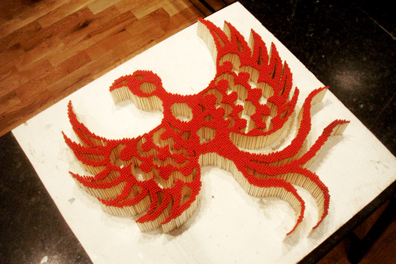
This is the third piece of my matches burn series. Since I am born in the year of the dragon and since I am a girl, I tend to see myself as the mythical creature of the phoenix (female version of the dragon in Chinese culture). It is a bird that is born out of its ashes, representing rebirth and transformation.
The size of this piece is 24″ x 22″ and was in the International Women’s Day Show at CAD on March 8th, 2010.
— Read more

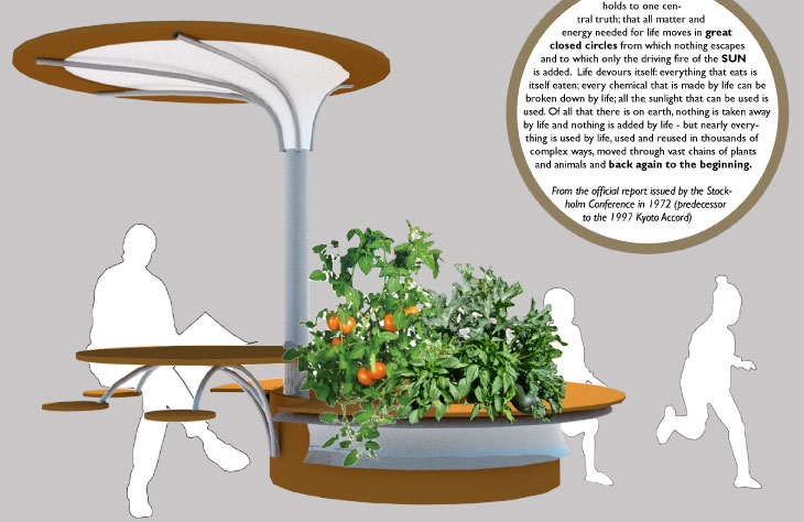
Full Circle Farm is a proposal submission for Chicago’s Chapter of Architecture for Humanity Street Furniture Competition. This was done for Trish VanderBeke. I assisted in generating the drawings (plan, section, detail), the 3d rendering collage and poster layout. This project was quite fun to do. It gave me a chance to brush up my 3d skills. I used Rhino and rendered with Maxwell.
This urban furniture captures rain water from the umbrella, which is also used as a shading device for users. The planter has soil that is held above the water reservoir. This unit can be placed in city vacant lots and/ or parks.
— Read more

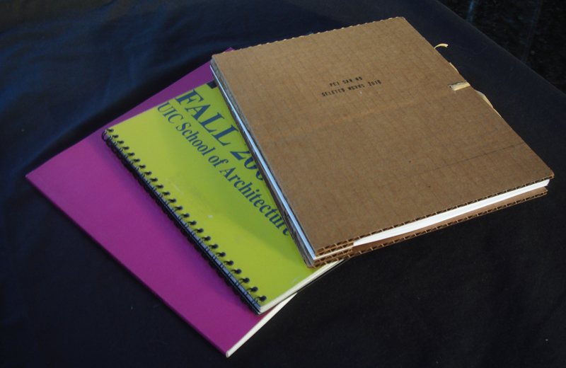
These are books I have created, specifically the print version of my portfolio. The cardboard was created last week. The pink one was created back in 2008 and the yellow one was created back in 2006.
The cardboard portfolio came about by me wanting to produce a book with a great deal of analog craft, with a feel of creation by the hand. In addition, in recession times, I wanted to create a book that is near zero dollar to produce. The card board cover was found in my studio, along with the cover text stamp. I did have to purchase the binding screw posts (100 count/$14), legal size paper (folded in half to get thickness and double sided-ness, 500 sheets/$10) and raffia ribbons (60 yard/$2). In total, a single book only costs me about 60 cents.
The cardboard book contains 12 pages, 3 projects. The beneficial part of using screw post bindings is that I can switch out projects or add more pages by switching the screw post size. The cover could be any found cardboard with the potential of integrating existing graphics from the cardboard.
The yellow portfolio was made for the annual UIC Portfolio Day. This was produced after my first semester at architecture graduate school. It contains projects from first design and technical (building science) courses. The book was printed on hard stock and the black double coil binding was outsourced, done by local printing company. This book was selected for Portfolio Day exhibition and won the Faculty Choice Award.
The pink portfolio contains most of my projects from school. The book was produced by online publishing company (lulu). To download for free or to buy a copy for $21, click here.
— Read more

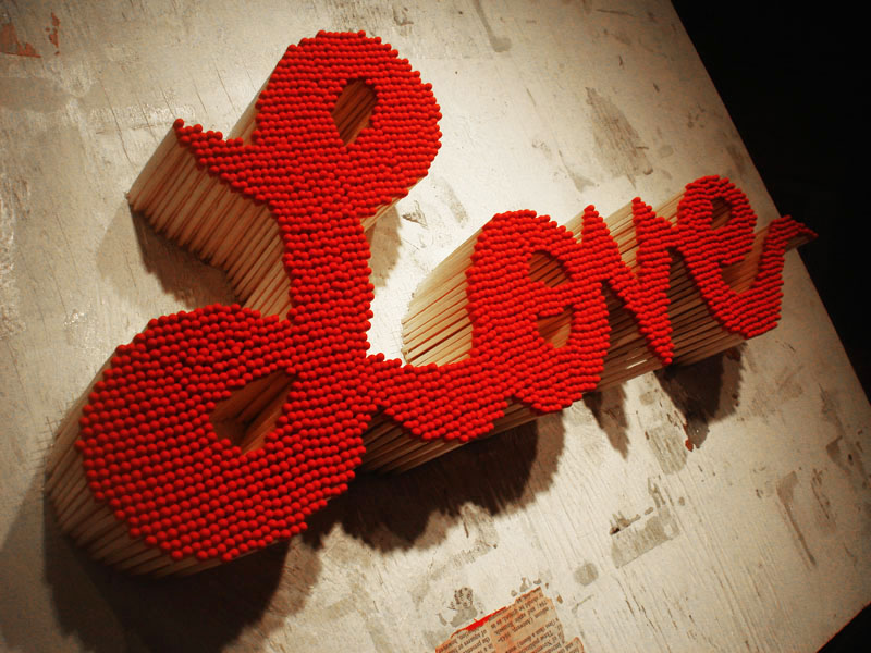
Made this in time for Valentine’s Day. This piece is made up of approximately 2,500 match sticks and took about a total of 24 hours (not in one sitting of course). The board is a reclaimed art board or plywood. It was previously used as a glueing surface. The type is hand drawn. Some see love on fire as passion, I, myself see this as the destructive and manic side of love.
— Read more

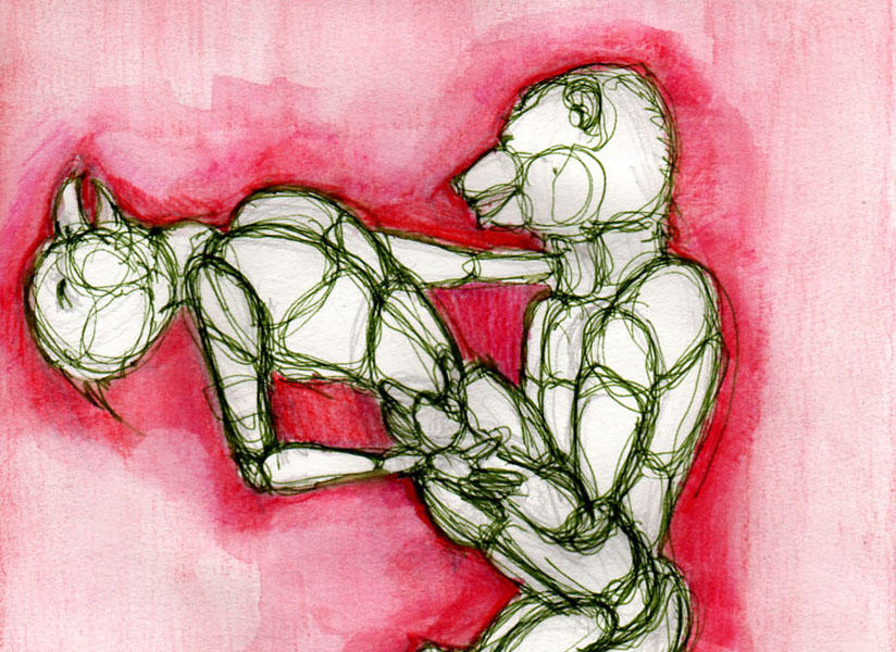
These drawings were done for Chicago Art Department’s City Study class. The premise of the class is to make art during the Bears football game. We are to make art about the cities that the Bears is playing against that Sunday or Monday. The class is a reason for us to get together, do something that we all like, which is to watch football and make art and why not do those two activities together. The art making session follows the format of the game thus we also get a half-time break.
The series that I choose to do is called “Mascot-sutra”. I choose to stay close to the football theme. My city study became about the city’s football mascot. When I watch football, I could not get over the imagery of grown men in tights wrestling and grunting together. And depending on which team is winning or losing that dictated who gets the dominate or inferior position. The medium is ink and watercolor.
I only have five drawings because as we all know that the Bears did not do so well this season. It was getting harder and harder to get together and watch our favorite team lose week after week. Eventually, we stop getting together.
An interesting fact, the first drawing that I did is actually not a karma sutra pose. Instead it was a “Dirty Dancing” pose however it was so sexual that it became a sex pose. The rest of the drawings just followed suit and that’s how the mascot-sutra came about. The order of the drawings are as such: Chicago Bears vs. Seattle Seahawks, Bears vs. Atlanta Falcons, Bears vs. Arizona Cardinals, Bears vs. Detroit Lions, and lastly Bears vs. Cincinnati Bengals. The class was featured on the Chicago News Cooperative (see last photo).
— Read more

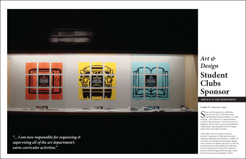
These are magazine spreads produced in indesign and illustrator. The first three are pages were designed for Art Professor, Nathan Peck’s tenure dossier book. The second to the last was produced for Chicago Art Department’s zine showcasing one of their resident artist. The last magazine page was created as an exercise in another graphic design course I took.
The display case was design in collaboration between Professor Peck and I. The three icons represent the three art clubs in the University.
— Read more

These square pages were produced in “Graphic Design for Architect” course that I took Spring 2008. We were asked to design page and cover layout using predominately black and white text. Color and an image were sneaked in later on.
— Read more
