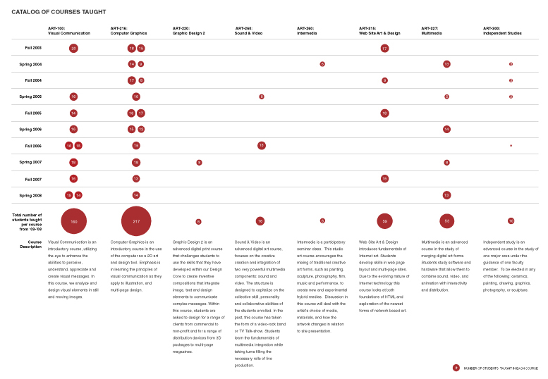
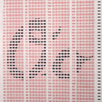
The first two diagrams were produced for Saint Xavier Art Professor, Nathan Peck’s tenure dossier book. The first chart is a list of all the courses he has taught, along with course description, total number of students in each course and the frequency or corresponding semester for each course. The size of the red dot is relative to the amount of total students he has taught for the course.
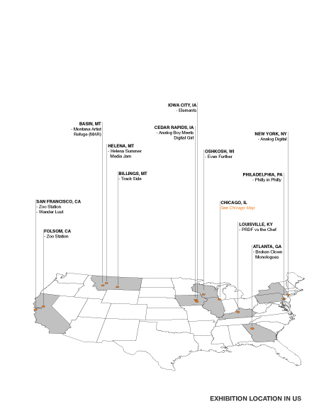
The second map was also created for Nathan Peck’s tenure dossier book. This diagram illustrates visually the locations and names of all his professional gigs or exhibitions across the United States.
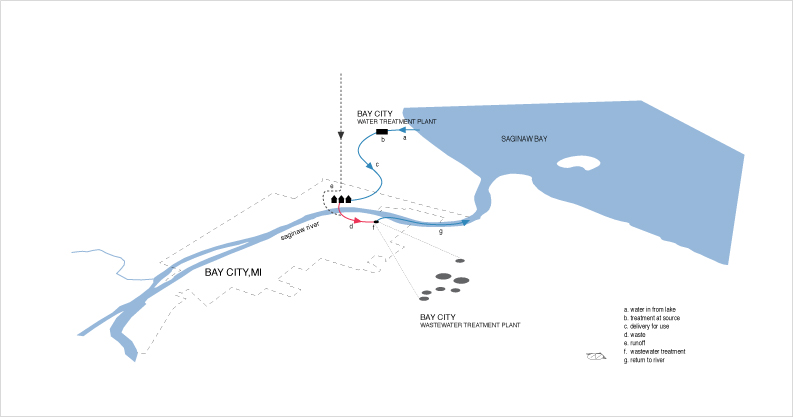
The third diagram was created for UrbanLab for their “Growing Water” book. This diagram illustrate the water cycle for Bay City, Michigan.
